Project Overview
The Project
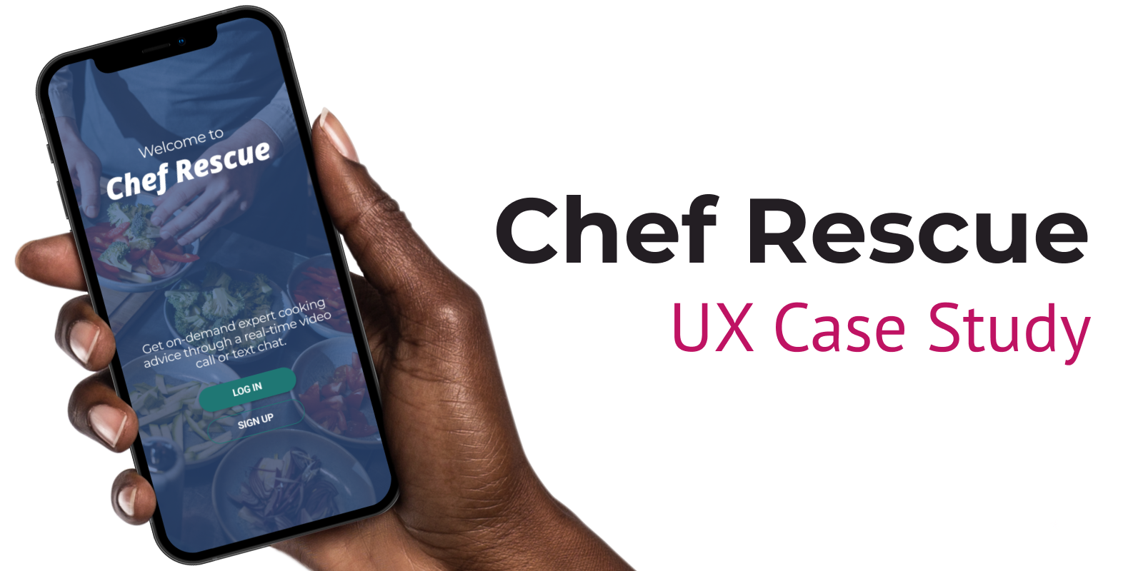
As a student in CareerFoundry’s UX Immersion course, I was tasked with designing a mobile-responsive app that allows users to instantly connect with an expert in a given field. For this project, I chose to focus on the problems faced by home chefs.
The duration of the project was 6 months.
My Role
I was the sole designer on this project, responsible for end-to-end completion of processes and design. I served as the UX researcher, IA designer, UX designer, and UI designer.
Tools
Figma
Google Forms
OptimalWorkshop
Pen and paper
UsabilityHub
Zoom
Deliverables
Competitive Research and Analysis
User Survey
User Interviews
User Personas
User Journeys and Process Flows
Sitemap
Wireframes and Prototypes
Usability Testing Report
Design Documentation
User Interface Design
The Problem
Home chefs need a way to ask for expert advice because they need guidance specific to their situation.
Users’ problems can be difficult to articulate in an online search.
Users want more specific information than what they can find in existing static content.
Users are limited by dietary restrictions or availability of ingredients, so they need more specialized assistance.
Users are unable to find a solution in the timeframe that they need it.
The Solution
Design an application that allows home chefs to seek personalized expert advice.
Users can enter a question and assign a broad category, such as “recipe” or “ingredient substitution.” These categories can drill down into more detailed subcategories that will help assign the right expert to deliver the solution.
Users can connect with experts live through either text chat or video call.
Experts will be well-versed in culinary and nutritional topics. For example, questions might range from, “What is a good substitute for smoked paprika?” or “How can I make this recipe gluten-free?”
Users can rate their satisfaction to ensure that the quality of the experts and their solutions remain high.
Competitive Analysis
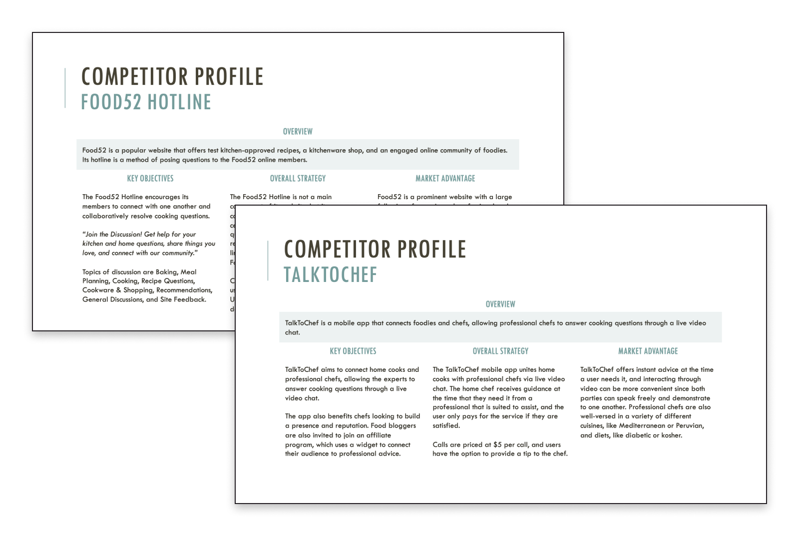
Though resources are plentiful when it comes to seeking cooking advice, many of them focus on static content and have limited interactive elements. Because Chef Rescue aims to provide on-demand and real-time interactions, focus was placed on two competitors offering similar solutions: Food52 and TalkToChef.
The analysis compared aspects of marketing and usability, and evaluated competitors’ strengths, weaknesses, opportunities, and threats. This helped identify features and functionality that could be included in Chef Rescue’s design.
User Research
Research goals:
Understand how users prefer to learn about cooking and where they turn to for advice.
Understand what users enjoy and what frustrates them about cooking apps and websites.
Understand the role of technology (e.g., desktop or mobile) when preparing a meal.
Quantitative Research: User Survey
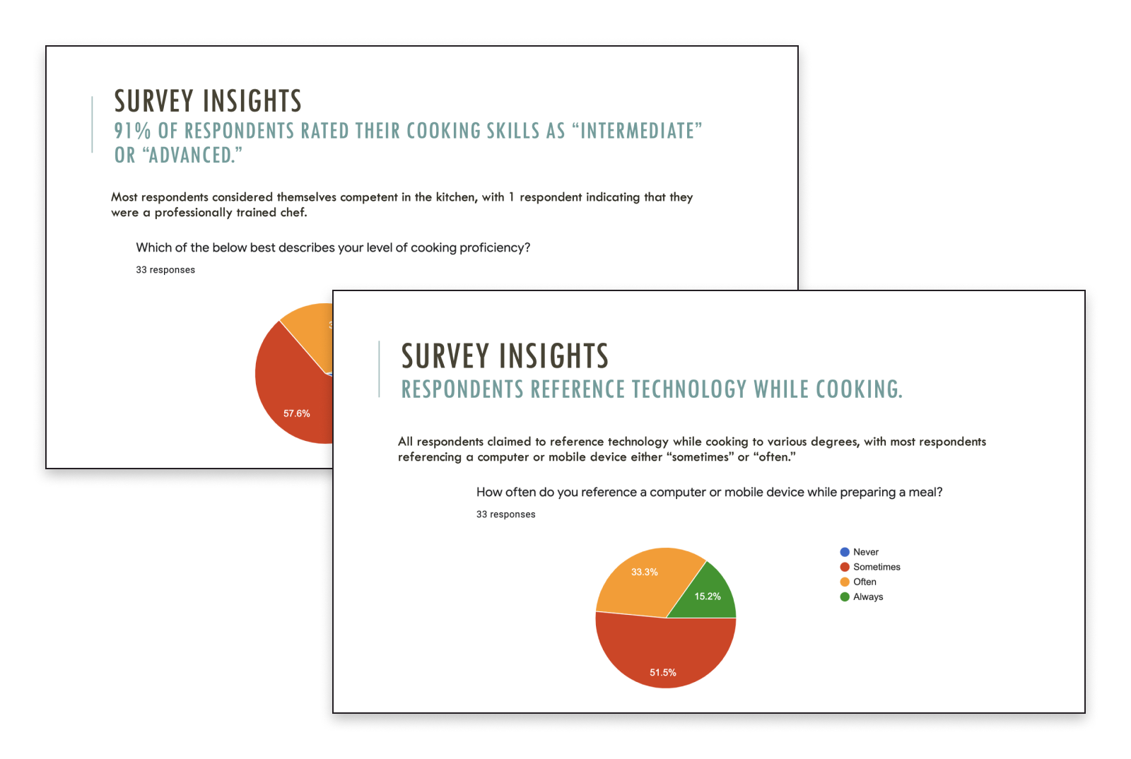
An anonymous Google Forms survey was administered and completed by 33 respondents. Responses helped in understanding the target audience’s goals, needs, and pain points. Responses also helped identify the topics that could be expanded upon during user interviews.
Key findings:
Respondents reference technology while cooking. All respondents claimed to reference technology while cooking to various degrees, with most respondents referencing a computer or mobile device either “sometimes” or “often.” This supports a need for a technological solution users can use while cooking.
Respondents trust resources with high ratings, and professional credentials are less important. When it comes to evaluating a resource’s credibility, many respondents ranked having a high rating online as “extremely important.” A high number of respondents also expressed that a resource’s professional credentials are “not important at all.” This indicates that users would value a solution that had a rating system for experts providing advice.
The most popular questions for respondents to ask were about ingredient substitution, temperature and/or cooking time, and technique. Respondents also frequently asked about nutrition and diet. The solution should provide an easy way to ask about these specific topics.
Respondents most often referenced search engines and family and friends to answer cooking questions. Other popular references were social media, specifically YouTube.
Respondents were asked what they found the most challenging about resolving cooking questions. The top two responses were: “I find it challenging when resources sometimes conflict with one another” and “I find it challenging when advice is not specific to my situation.” This provides a strong case for the expert consultation format, since users can interact one-on-one about specific topics.
Qualitative Research: User Interviews
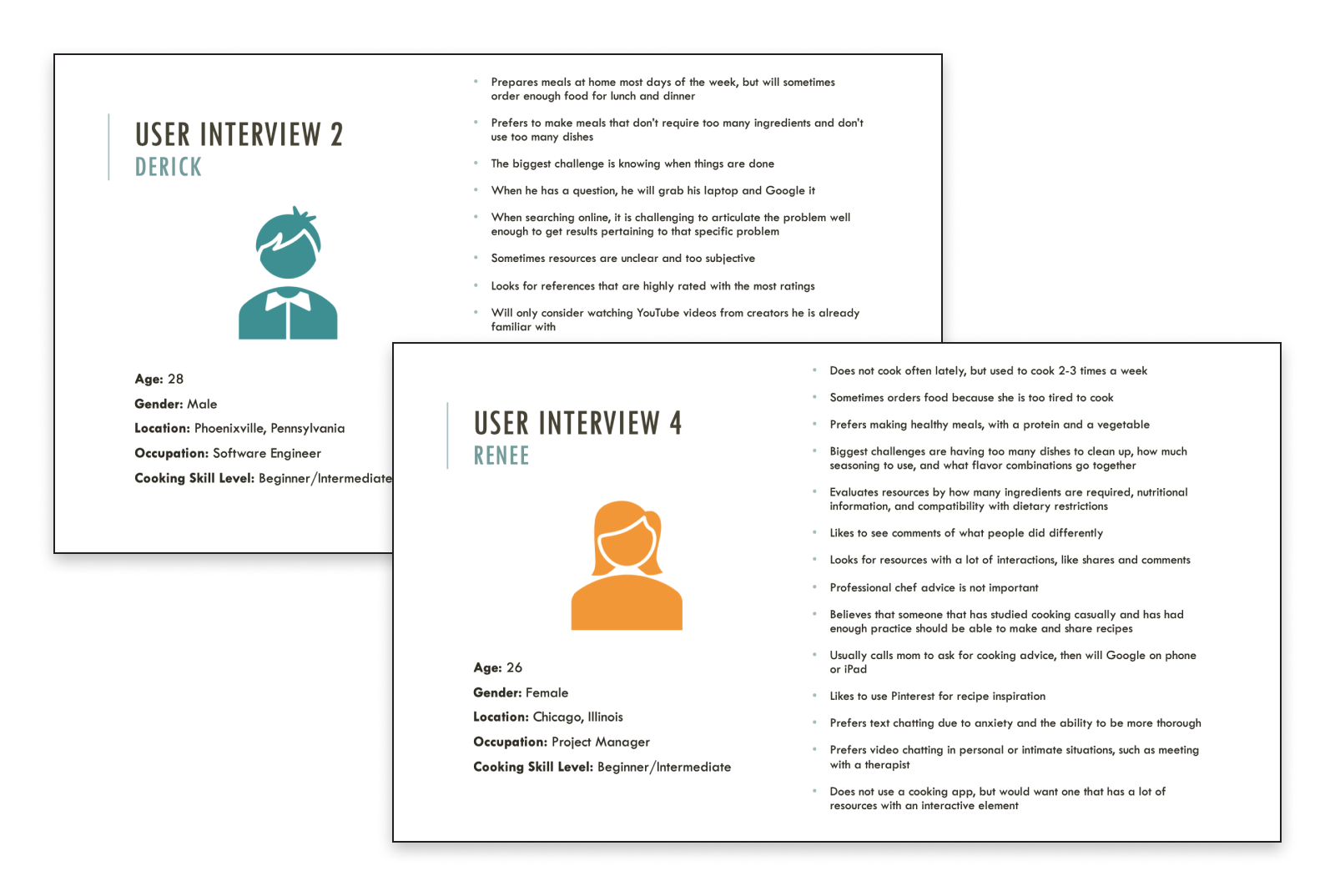
A total of 4 participants representative of the target audience were interviewed remotely via Zoom.
Questions focused on:
users’ process and habits when preparing meals
how users address challenges when preparing meals
how technology and online resources are involved in problem solving
ways users determine resources are credible
Affinity Mapping
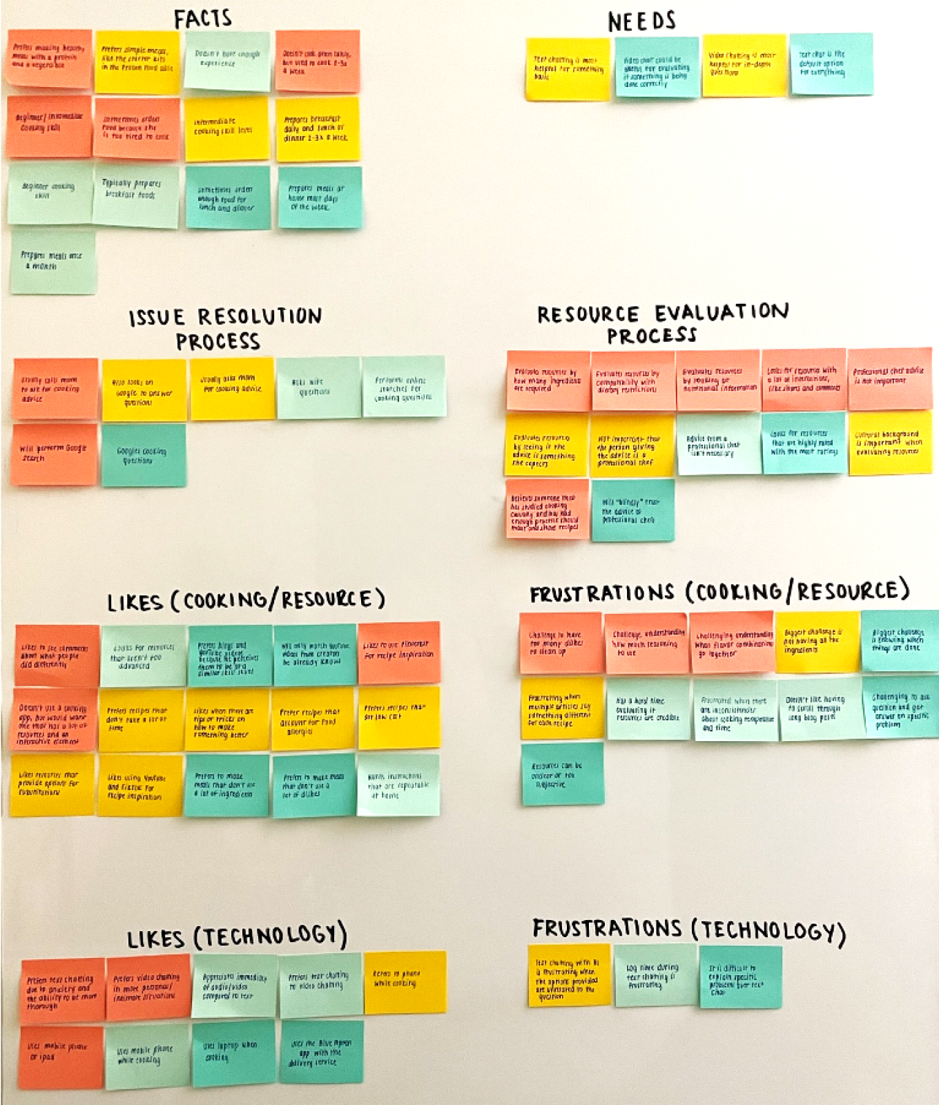
Data from user interviews was organized into eight clusters to reveal common patterns and themes.
Facts
Needs
Issue Resolution Process
Resource Evaluation Process
Likes (Cooking or Resource)
Frustrations (Cooking or Resource)
Likes (Technology)
Frustrations (Technology)
Key findings:
Users generally prefer text chatting to video chatting, especially for questions that can be answered quickly. However, users were frustrated with how long text interactions sometimes took and how to best articulate their question. This supports the decision to have both text and video chatting options.
Users recognize video chatting can be a good option for asking detailed questions and seeing demonstrations.
Users gravitated towards resources with positive social interactions (e.g., ratings, comments, and shares). This provides further support for including a rating system as part of the solution.
Though users generally trust professional chefs, they do not believe that they are the only ones capable of providing credible cooking advice. This widens the pool of potential experts, since users do not prioritize experts with professional credentials.
User Personas and Journeys
Insights from the user survey and user interviews aided in the development of three user personas to guide future design decisions. The primary personas, Matthew and Andrea, closely fit into Chef Rescue’s target audience of users between 18 and 40 years old. A third persona, Steven, was created since it is likely that at least a portion of users will be from an older age demographic.
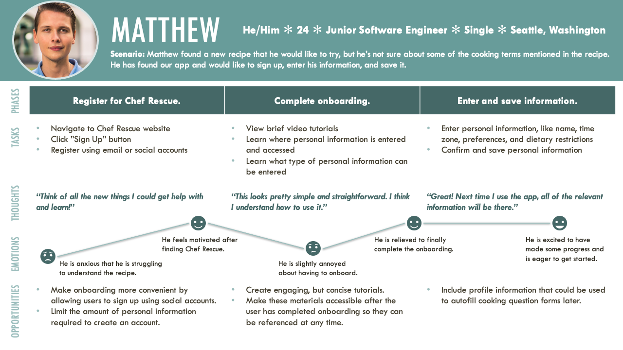
User journeys were created to understand what each persona would go through when completing a task. This includes their thoughts and emotions, which uncovered opportunities to build helpful functionality into the Chef Rescue app.
A sample user persona and user journey for Matthew is below:
Information Architecture
Several main groupings emerged during the development of user personas and user journeys. An initial sitemap based on these groupings was created, and a card sorting exercise conducted to confirm it.
Card Sorting
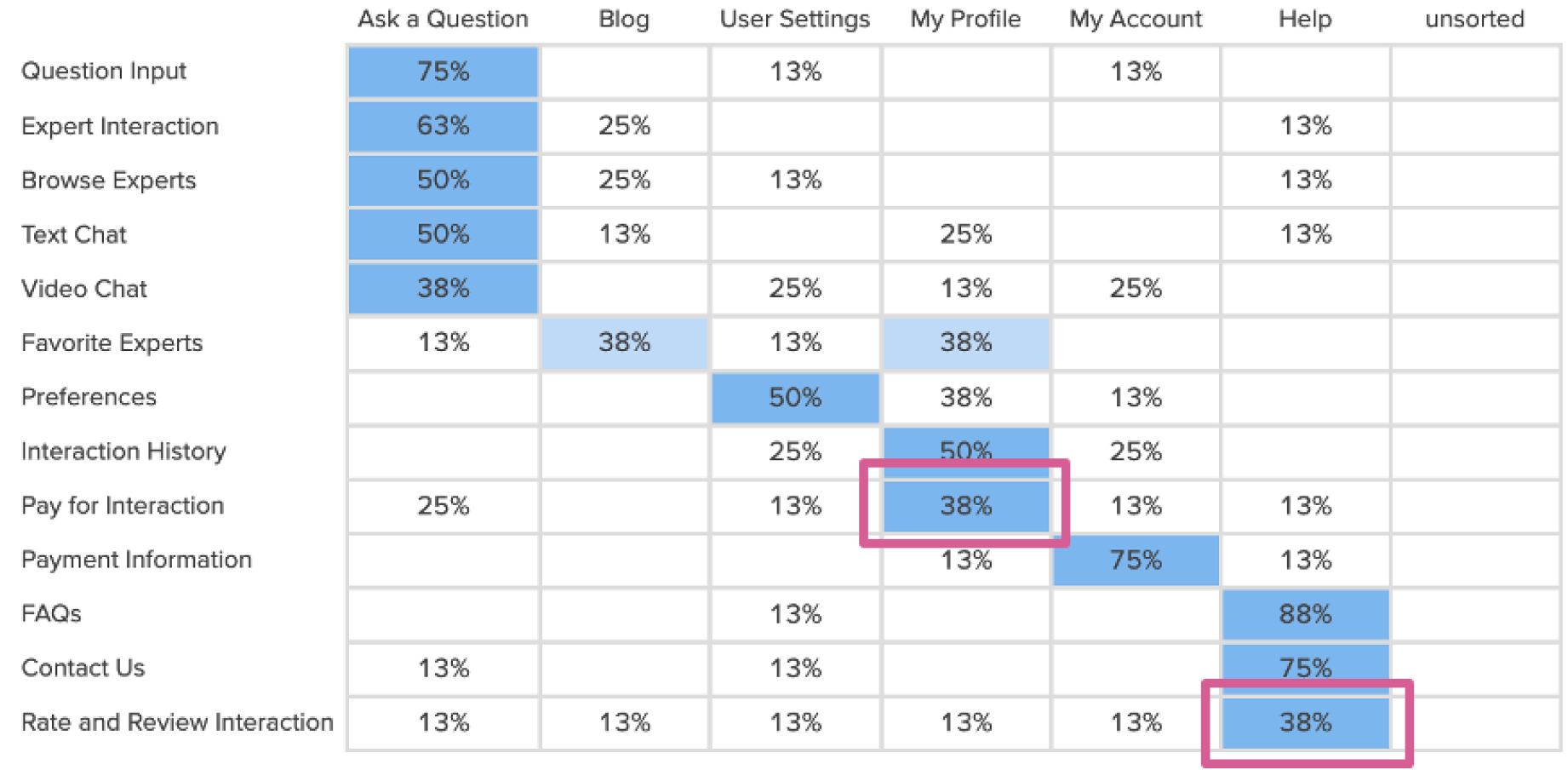
A closed card sorting task was conducted using OptimalSort on OptimalWorkshop. Cards and categories were arranged randomly for each of the eight participants to minimize potential bias.
Card Sorting Analysis
The card sorting analysis validated much of the existing sitemap, but it also identified opportunities for improvement.
Participants sorted key functions, like “Pay for Interaction” and “Rate and Review Interaction” outside the “Ask a Question” category. It might have helped to provide more context or give pages and subpages more descriptive names. Participants also seemed to have differing ideas about what belongs in the “Blog” category. The most significant observation was how participants sorted the cards under “User Settings", “My Profile,” and “My Account.”
Sitemap
Prototyping
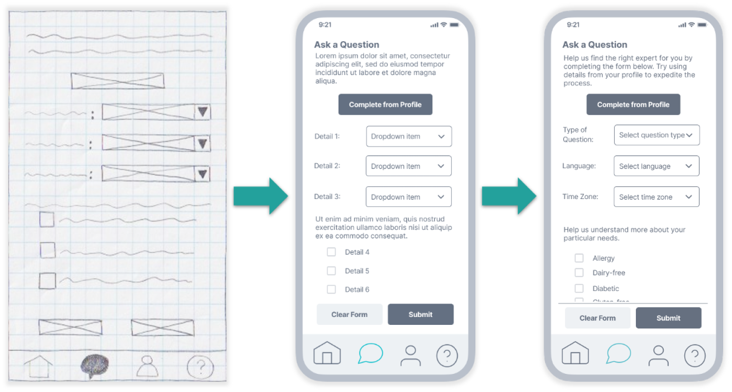
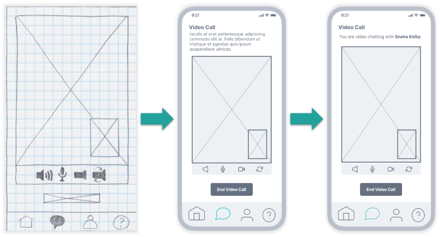
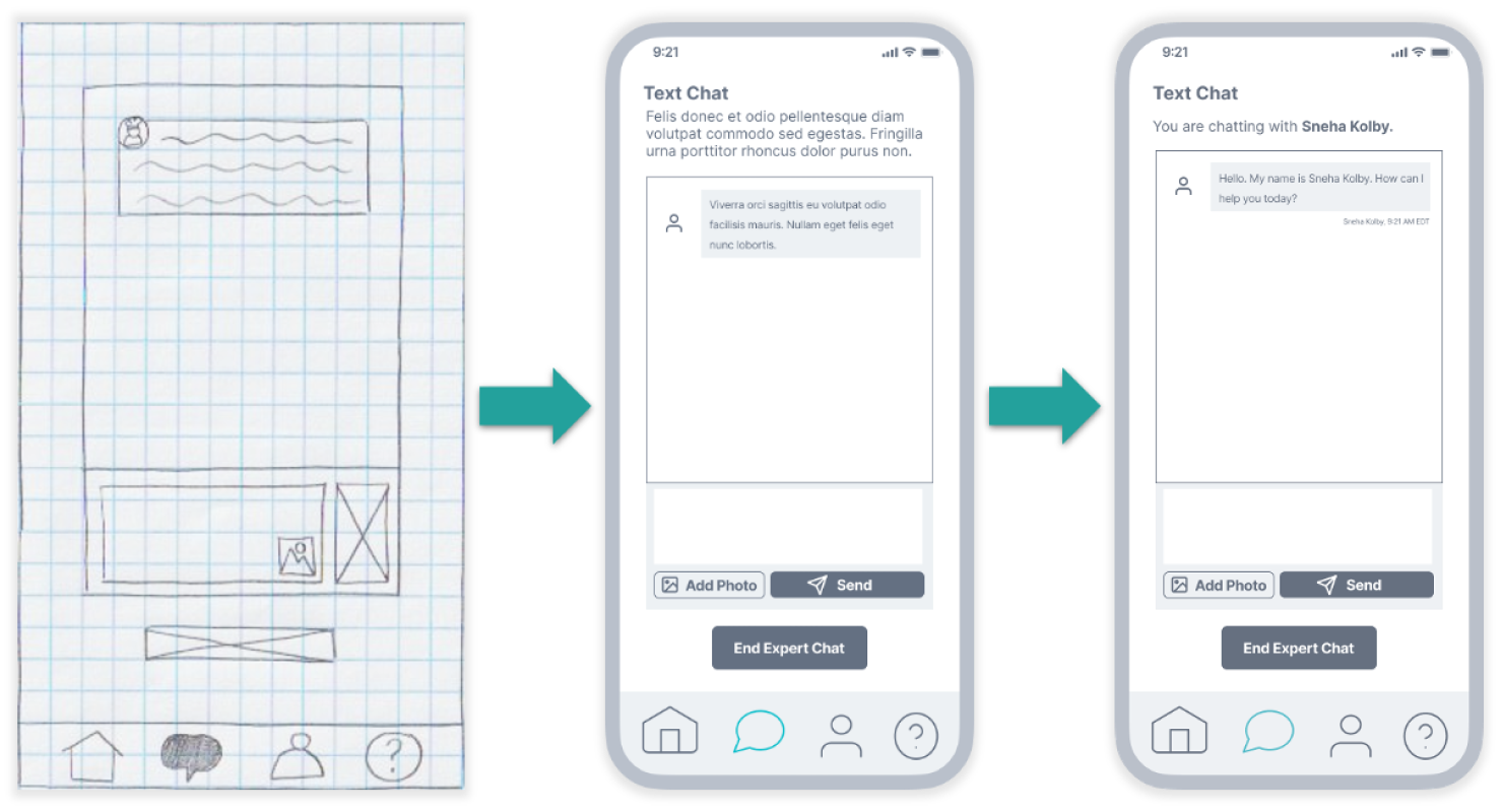
Pen and paper was used to create wireframes and a low-fidelity prototype. This helped in visualizing Chef Rescue’s main features and establishing the app’s look and feel. The prototype was then upgraded to a mid-fidelity, then high-fidelity prototype in Figma.
Feature: Ask a Question
Feature: Browse Experts
Feature: Expert Interaction (Video Call)
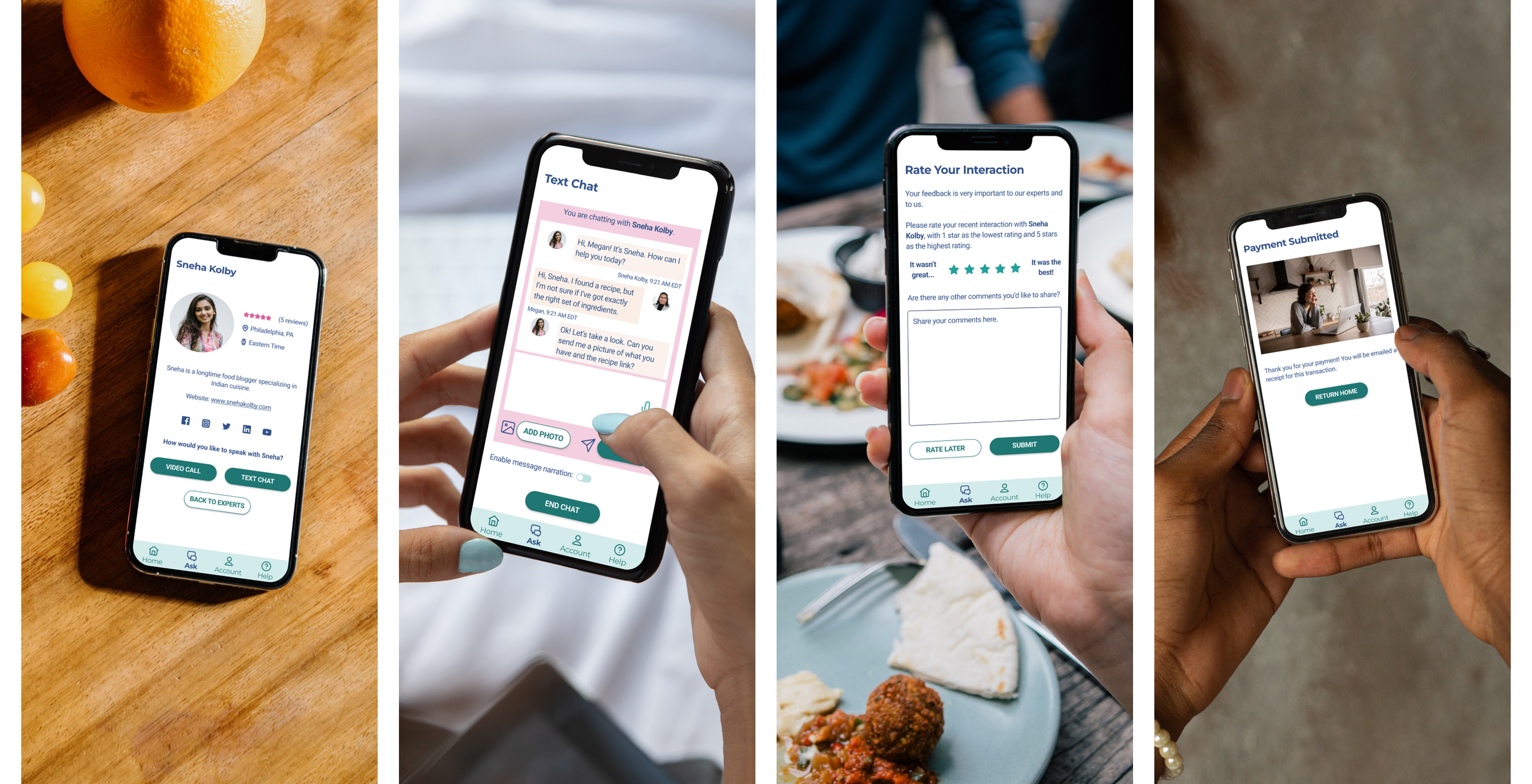
Feature: Expert Interaction (Text Chat)
Usability Testing
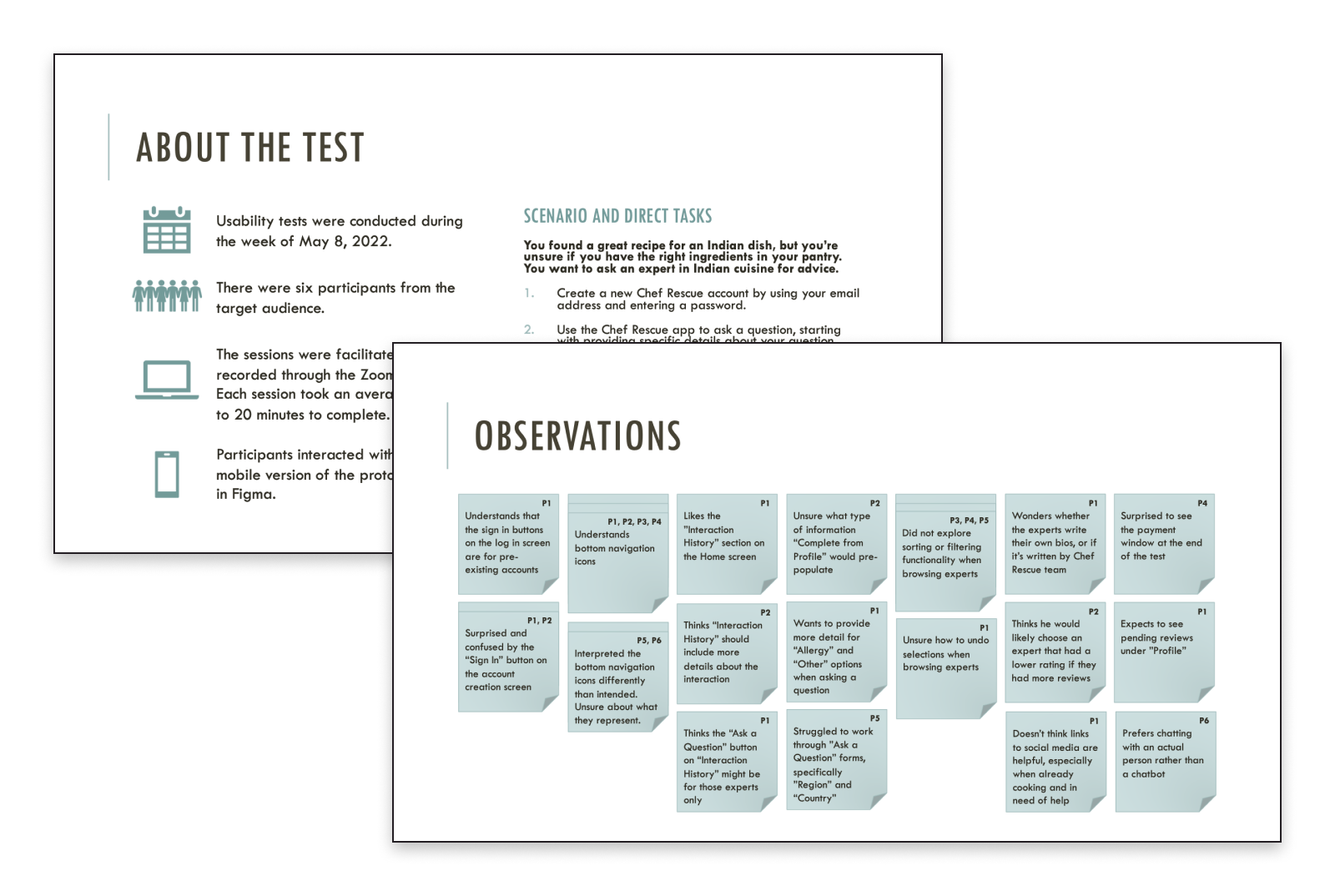
Remote usability testing was conducted with six participants from the target audience. The sessions were facilitated and recorded through the Zoom platform. Each session took an average of 15 to 20 minutes to complete. Participants interacted with the mobile version of the high-fidelity prototype.
Goals and Objectives
The primary goal is to assess the usability of the Chef Rescue prototype for users that are interacting with the app for the first time.
Test Objectives:
Determine if users understand the app’s purpose and can ascertain the perceived value of the app.
Identify points of friction for users and why they are challenging.
Assess users’ level of confidence when using the app, specifically the three main features: Ask a Question, Browse Experts, and Expert Interaction.
Scenario and Direct Tasks
You found a great recipe for an Indian dish, but you’re unsure if you have the right ingredients in your pantry. You want to ask an expert in Indian cuisine for advice.
Create a new Chef Rescue account by using your email address and creating a password.
Use the Chef Rescue app to ask a question, starting with providing specific details about your question.
Use the Chef Rescue app to browse available experts and choose one to answer your question.
Select whether you would like to participate in a video call or text chat, initiate the expert interaction, and complete it.
Now that you have completed the interaction and received advice, please rate your expert interaction.
High-Level Observations
Participants seemed to use devices during meal preparation in similar ways, regardless of age or cooking skill level. Most participants referred to some type of recipe on their devices while cooking.
Participants in the younger age cohort evaluated online sources based on ratings and reviews. Participants in the older age cohort evaluated online sources based on whether the advice was what they expected.
During usability testing, most of the participants successfully navigated the Chef Rescue app and eventually completed the requested tasks as intended.
Points of friction occurred most frequently when asking a question and browsing experts.
Affinity Mapping
Observations were organized into an affinity map to gain deeper insights and improve the Chef Rescue experience.
Rainbow Spreadsheet
Observations were further organized into a Rainbow Spreadsheet to help inform changes made to the next iteration of Chef Rescue. In this spreadsheet, items were analyzed and prioritized based on a modified version of Jakub Nielsen’s error severity scale. View the Rainbow Spreadsheet here.
Making Improvements
After the usability test, four medium to high severity issues were identified as areas of improvement. Changes were made to the prototype to improve usability based on these areas.
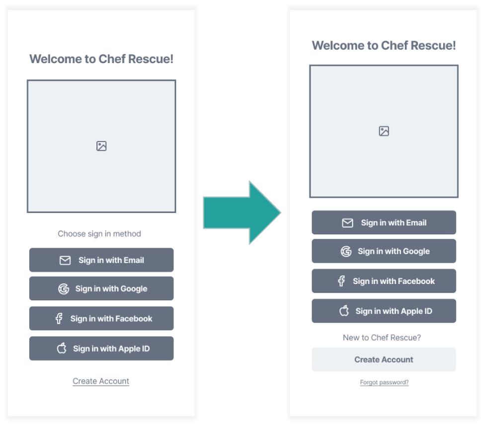
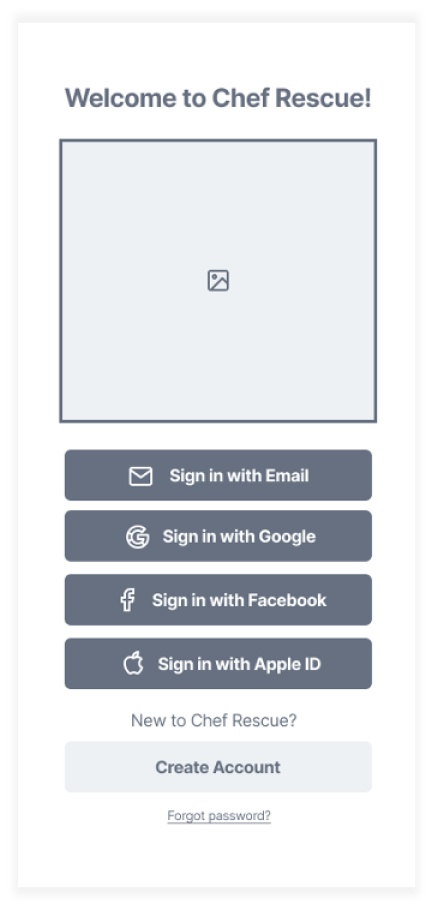
Issue 1: When creating a new account, some participants selected “Sign in with Email” instead of “Create Account.”
Severity: High
Suggested Changes:
Add text that says “New to Chef Rescue?”
Convert the “Create Account” link to a button and differentiate it with color so users can tell the difference between creating a new account and signing into an existing account.
Evidence: The first direct task participants were given was to create a new account. Four participants selected the “Sign in with Email” button instead of the “Create Account” link.
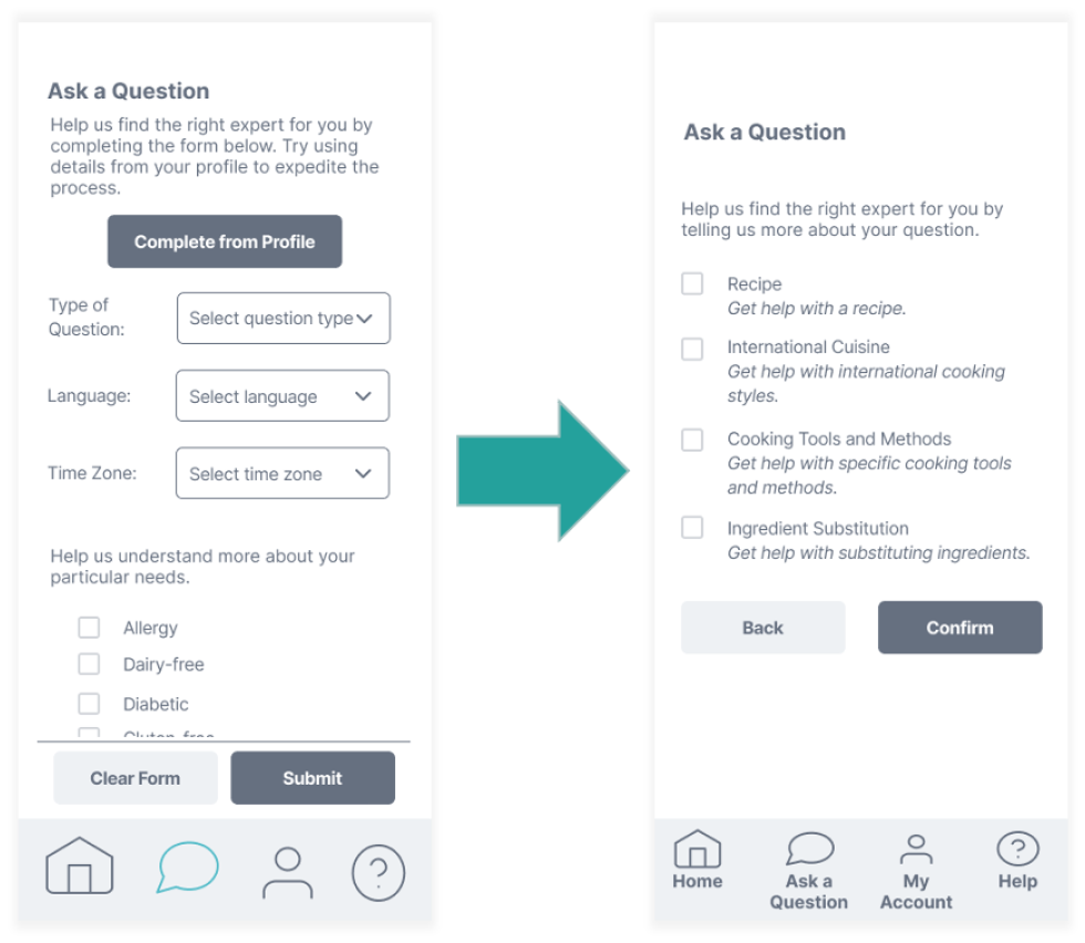
Issue 2: Some participants interpreted the meaning of the question types differently, and consequently did not choose the intended question type.
Severity: High
Suggested Changes:
Change the dropdown to check boxes. This will allow users to select more than one question type if their inquiry covers multiple topics.
Include definitions of each question type to help users categorize their questions.
Evidence: Three participants initially chose question types that were different from the intended one. Question types were not interpreted uniformly among participants, which illustrates a need to establish clear definitions.
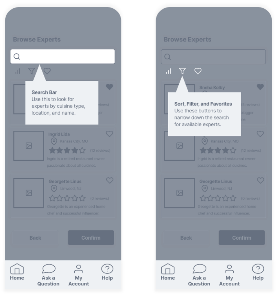
Issue 3: Participants did not explore the search, sort, or filter functionality when browsing experts.
Severity: Medium
Suggested Changes:
Add coach marks to the expert results screen highlighting the search bar and sorting and filtering buttons.
Evidence: Three participants did not use these buttons at all, while one participant used the search bar to ask a question.
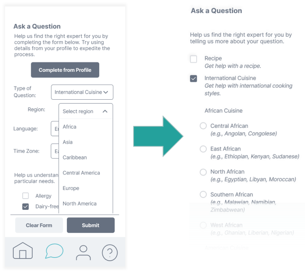
Issue 4: Some participants struggled or needed assistance navigating through the “Region” and “Country” fields when asking a question.
Severity: Medium
Suggested Changes:
Include a list of only the most popular or common types of cuisine so that the list of options doesn’t become too lengthy or overwhelming.
Evidence: Some participants hesitated when working through the “International Cuisine” fields to ask a question. One participant needed guidance to select a continent from the “Region” field before selecting the country.
Preference Testing
User errors during usability testing suggested that the layout of the log in and sign up screen is not as intuitive as intended. A preference test was conducted remotely using UsabilityHub. There was a total of 10 participants who were asked to indicate which sign-in screen they preferred. Participants were given the choice between the recently redesigned sign-in screen or a simplified version.
Participants were also asked to provide a reason why they preferred one screen over another.
Version 1: Recently Redesigned
Version 2: Simplified
Preference Testing Results
All the participants tested preferred Version 2, or the simplified sign-in screen. The most commonly used words by participants were “simple,” “easy,” and “less.”
Responses included:
“This one looks simple and easy to digest the information.”
“Less going on, on the screen…simple to the point.”
“Cleaner look, not inviting me to link accounts right from the outset, and faster communication of my options.”
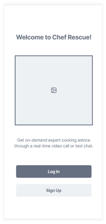
The prototype was updated to include the redesigned sign-in screen. Instead of being presented with a list of options, users are now presented with two simple options, “Log In” or “Sign up.” Returning users can then choose their preferred sign in method.
UI Design
The UI design process included the iterations below:
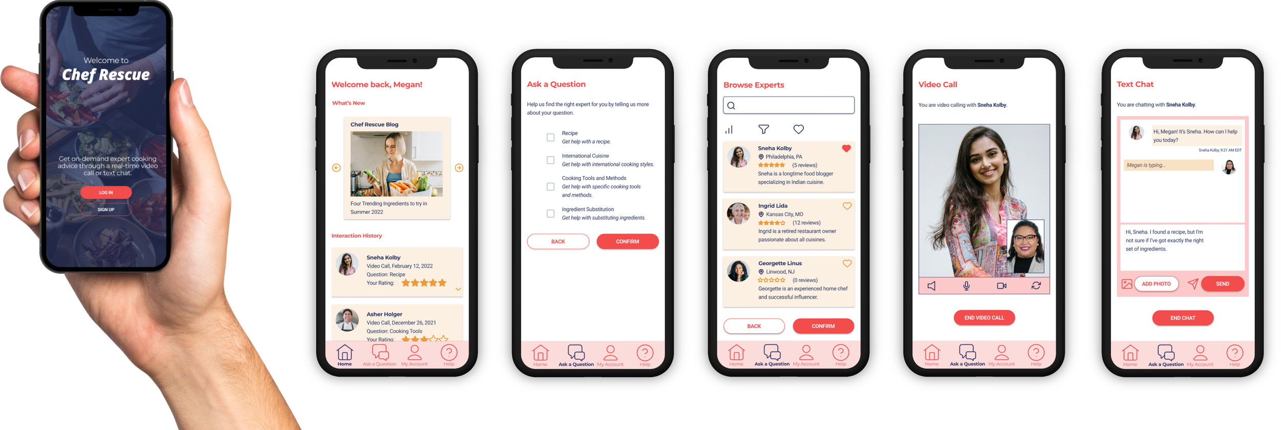
Initial UI design - The first iteration of my UI design.
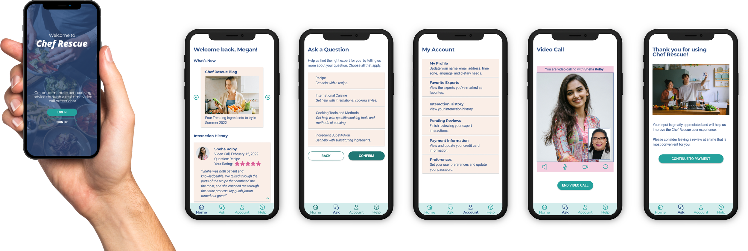
Design collaboration - The updated version of my UI design, influenced by feedback from fellow designers.
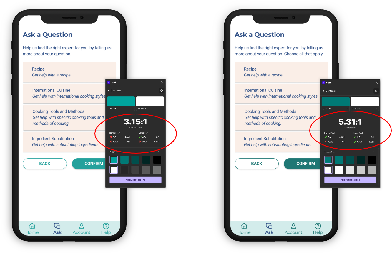
Accessibility redesign - The final version of my UI design, improved by considering the goal of greater accessibility.
Initial UI Design
The color palette for the initial UI design was shaped by the prevalence of red and yellow in the food industry. Studies on color have shown that red encourages appetite, while yellow is considered cheerful and warm. Additionally, many users likely associate these colors with other food-related apps or brands, since red and yellow are popular in food marketing.
Design Collaboration
Three CareerFoundry UX design students provided feedback in Figma on the initial UI design. This process provided a fresh perspective on earlier design decisions. It was especially helpful to get feedback from other designers that could pair constructive criticism with actionable suggestions.
Major UI changes were influenced by the feedback below:
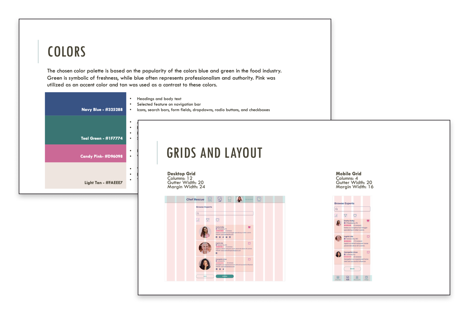
Color scheme is too harsh. Collaborators noted that red evokes a sense of “urgency,” while the use of white text on a red background was described as “jarring.” Based on this feedback, the color palette was redesigned in favor of blue and green. Blue and green are also popular in the food industry and convey freshness and authority.
Card colors and actions are hard to differentiate. The redesigned card shows star ratings in a contrasting color that is the same as other CTAs throughout the app.
Font size should be larger and font color should be consistent. The font size was increased for better readability on mobile devices and heading font color was changed to not compete with CTA buttons.
Bottom navigation icons and text could be more proportional and concise. Reducing the icon size allowed for more content space. The icon labels were also simplified to reduce cognitive load.
Checkboxes can be hard to access on a mobile device. Checkboxes were converted to cards, which gives users a larger target area to tap.
Accommodate CTA text by increasing button width. Widening buttons, such as “Continue to Payment” allowed for more space for the text and it looks more like other buttons in the design.
Accessibility Redesign
The peer collaborators were very accessibility conscious, so many of the recommended changes ultimately improved user accessibility. However, there were still several points of improvement that would increase Chef Rescue’s accessibility.
A summary of the changes are listed below:
Form field labels and placeholders were added to help users understand what information needs to be provided and where.
Greater contrast between font color and background color is more readable to users.
Speech recognition technology can increase the accessibility of the expert text chat and video call. Speech recognition technology has improved over recent years and can be applied to Chef Rescue to make it more accessible to everyone. For the expert chat, this includes voice to text dictation and message narration. For expert video call, this includes automatic subtitling, similar to what is offered on YouTube and other platforms.
Including both text and voice search caters to users with various disabilities.
Design Documentation
All the design elements were captured as part of the Chef Rescue Design Language System. The documentation defines a set of standards that determine the visual components, language, and tone of the app.
Chef Rescue Demo and Prototype
Final Thoughts
It was challenging to design Chef Rescue end-to-end, but it was rewarding and I learned a lot along the way. I approached designing Chef Rescue as if it was a real life project.
I drew upon my experience as a project manager to plan and complete the project on time. My analyst skills proved invaluable as I conducted competitor and user research, analyzed the findings, and applied them to my design. Experience in business and marketing helped me in making decisions on a strategic level.
Lessons Learned
Seek feedback early and often. Feedback in the form of usability testing, preference testing, and design collaboration greatly helped to improve my design and make it more usable. Having outside perspectives allowed me to create a design with less personal bias.
Be mindful of accessibility issues. The design collaboration exercise showed me the importance of designing for accessibility and being mindful of the user’s device. Things like color contrast, font size, button width, and more descriptive copy can help make a design more accessible and pleasant to use.
Research and make use of design and productivity tools. As I designed, I regularly consulted Figma resources I found on Google and YouTube to help bring the vision to life. Similarly, scheduling user interviews and usability testing with multiple participants was challenging. Tools like Calendly could help simplify the experience and make scheduling a better experience for participants.
Future Plans: New Features
Allow users to choose between an on-demand session or scheduling expert interactions ahead of time.
Onboarding could be improved by designing a more detailed splash screen that showcases features to help educate and attract users. Coach marks can also be added to “Ask a Question” screen to guide users through the process of asking a question.
Speech recognition could be utilized across the entire Chef Rescue application to improve accessibility.

